CONCEPT 2026cobas® Infinity
SKILLSTOOLSPrototyping
User Research
TIMELINEROLEApril - June 2026
UX Designer

Visual Design
Iterative Design
How do you improve efficiency in a fast-paced clinical environment in one of NSW’s busiest hospitals?
OVERVIEWAs part of a usability research project, I investigated the rollout of Roche’s Infinity (now Navify) middleware at one of NSW’s busiest hospital laboratories. The new system was introduced alongside new biochemistry semi-automated instruments to improve laboratory efficiency and turnaround times, replacing the legacy IT3000 middleware platform. I focused on the validation workflow, using user research and usability testing to understand how scientists interacted with the new system and where it supported, or hindered, everyday decision-making.
PROBLEMA system designed to support quick decision-making was slowing scientists down.
Infinity was introduced to replace IT3000 and improve laboratory efficiency, yet scientists preferred the legacy system for its more intuitive validation workflow. Extra steps, unclear alarms, and poor prioritisation of critical results made the new system harder to navigate and slowed decision-making.
SOLUTIONThe research revealed that users needed more than just information, but they needed clarity, reassurance, and confidence before committing to treatment. I redesigned the SportsFit website around three key moments in the user journey: discovering the right service, choosing a trusted physiotherapist, and accessing helpful educational content.
Transforming the journey from discovery to booking.
CORE FLOWSFind the right service
Compare treatment options through a clear, easy-to-scan service overview.
Clear service discovery
Restructured service information with stronger visual grouping, helping users scan treatment options more easily.
Guided decision-making
Introduced the five-phase process and educational content to help users understand the treatment journey before committing.
Reduced booking friction
Added contextual CTAs throughout the page to guide users towards booking at relevant decision points.
Meet your practitioner
Learn about each practitioner’s expertise before booking with confidence.
Build trust through expertise
Restructured practitioner profiles to prioritise qualifications, specialties, and experience.
Supported confident choices
Added clearer practitioner information and a direct booking pathway once users had evaluated their options.
Explore educational content
Access injury-specific articles and recovery advice to support informed decision-making.
Create consistency across the experience
Applied the wider design system to the blog to create a more cohesive journey.
Improve content discovery
Simplified categories and strengthened labels to help users find relevant articles.
RESEARCHInvestigating the gap between intended and actual workflow.
In 2024, NSW Health Pathology rolled out new Roche cobas® instruments across biochemistry laboratories throughout New South Wales, alongside Infinity as the new middleware platform replacing the legacy IT3000 system. During the rollout, Infinity was positioned as a more efficient and reliable solution for managing high-volume laboratory workflows.
At Prince of Wales Hospital, the biochemistry laboratory processes approximately 1,000 samples each day. As a scientist and system user, I experienced firsthand the gap between these intended efficiencies and the realities of the new validation workflow. To determine whether these challenges extended beyond my own experience, I conducted seven surveys and three interviews with scientists and senior scientists – the primary users authorised to operate Infinity at full capacity. To further understand their experiences. The research explored their experiences with the system, pain points within the validation workflow, and how Infinity compared with IT3000.
INSIGHTS“Upgrade” did not feel like an upgrade

Users expected Infinity to modernise and simplify the laboratory validation workflow, but many experienced slower performance, lower intuitiveness, and one user described that it was “not user-friendly to the current workflow”
Repetitive actions increased mental workload and error risk

Repetitive steps such as multiple save steps and validation actions increased mental demand and introduced opportunities for user error.
Information architecture slowed decison-making

The validation screen did not consistently support rapid decision-making. Poor visibility of alarms, crowded layouts, and fragmented navigation increased cognitive effort during high-volume workflows.
Strong demand for workflow customisation

Users valued greater screen customisation offered by IT3000 for them to tailor the validation screen to their individual workflow. Infinity provided less flexibility, requiring users to move between screens to access information they previously had readily available.
Missing context reduced confidence

Users repeatedly mentioned lacking access to contextual information in order to validate confidently, often forcing reliance on external systems, instruments, or workarounds.
Redundant alarms created cognitive overload

The validation screen already contains a high volume of information, making clear prioritisation essential. Users felt that these additional alerts distracted from results requiring genuine action, contributing to verification fatigue and making it harder to distinguish important information from noise.
RESEARCH SYNTHESISUnderstanding user behaviours and frustrations.
With a clearer understanding of the business, competitors, and users, I synthesised the research into a set of UX artefacts that helped prioritise pain points, align design decisions, and map the ideal booking experience.
To better understand the user’s perspective, I mapped key thoughts, behaviours, and frustrations based on survey responses and research findings into an empathy map. This helped uncover the emotional and practical barriers users experienced when navigating the SportsFit website.
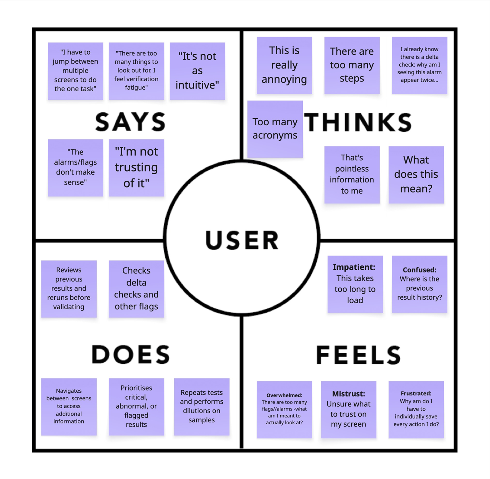
The empathy map revealed several usability issues preventing users from confidently moving through the booking journey.
Hard to read content
Fonts and sizing make information difficult to scan, reducing accessibility.
Inefficient interface
Long scrolling pages and outdated styling slowed users trying to quickly access essential information.
Cluttered visual design
Busy layouts made important information harder to find and increased cognitive load.
Underutilised educational content
Helpful resources existed but were not strategically positioned to support users during decision-making.
Unclear CTAs
Buttons are easy to miss or poorly placed, leading to confusion and missed actions.
These findings highlighted that users did not simply need more information; they needed a clearer path to understand SportsFit’s services, build trust, and take action with confidence.
Putting the user at the centre of design decisions.
Building on the empathy map findings, I created a persona to represent the needs, behaviours, and motivations of SportsFit’s typical user.
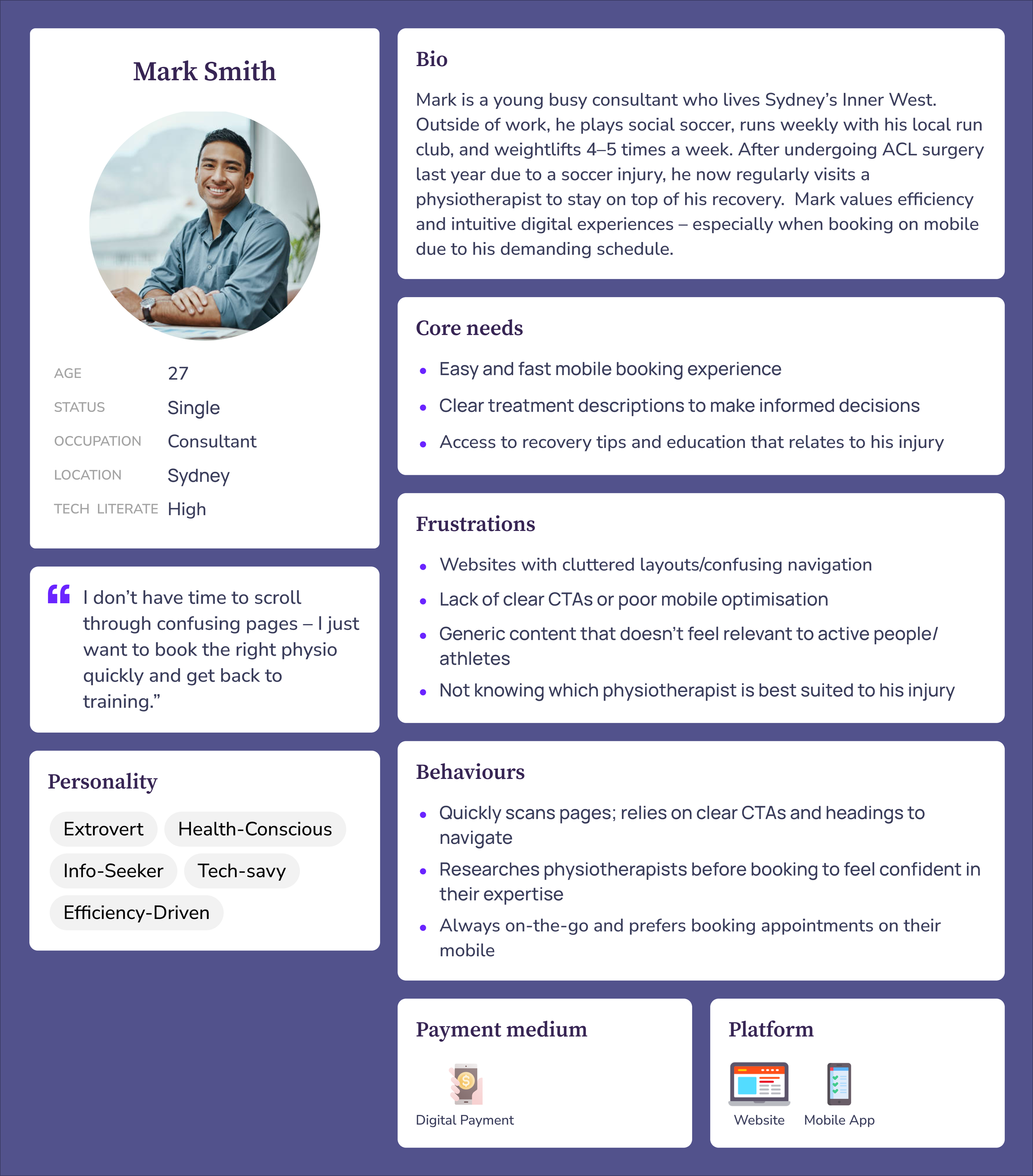
Meet Mark, a young professional seeking physiotherapy support for injury management.
Mark values efficiency, clear guidance, and confidence in his healthcare provider before booking an appointment. His frustrations with unclear information, difficult navigation, and limited reassurance reflected broader patterns identified during research.
Keeping Mark at the centre of the design process helped evaluate whether each decision supported a smoother journey from discovering SportsFit’s services to completing a booking.
DESIGN OPPORTUNITIESTranslating research into actionable improvements.
Combining insights from the empathy map, persona, and competitor analysis, I identified three key opportunities to improve the SportsFit experience.
Make essential information easier to discover

Users needed to quickly understand available services, treatment options, and next steps.
Design response: Create clearer information hierarchy and simplify content structure.
Build trust before asking users to commit

Users wanted confidence in the expertise and credibility of the clinic before booking.
Design response: Highlight practitioner profiles, testimonials, and educational content earlier in the journey.
Create a seamless path to booking

Users expected a fast and intuitive booking experience across devices.
Design response: I Introduce consistent CTAs, simplified navigation, and mobile-first interactions.
Defining the path from discovery to booking.
With these opportunities identified, I mapped the key user flows to understand how users currently navigated the website and define a more intuitive pathway. This helped ensure that the redesign guided users efficiently from discovering a service through to completing a booking.
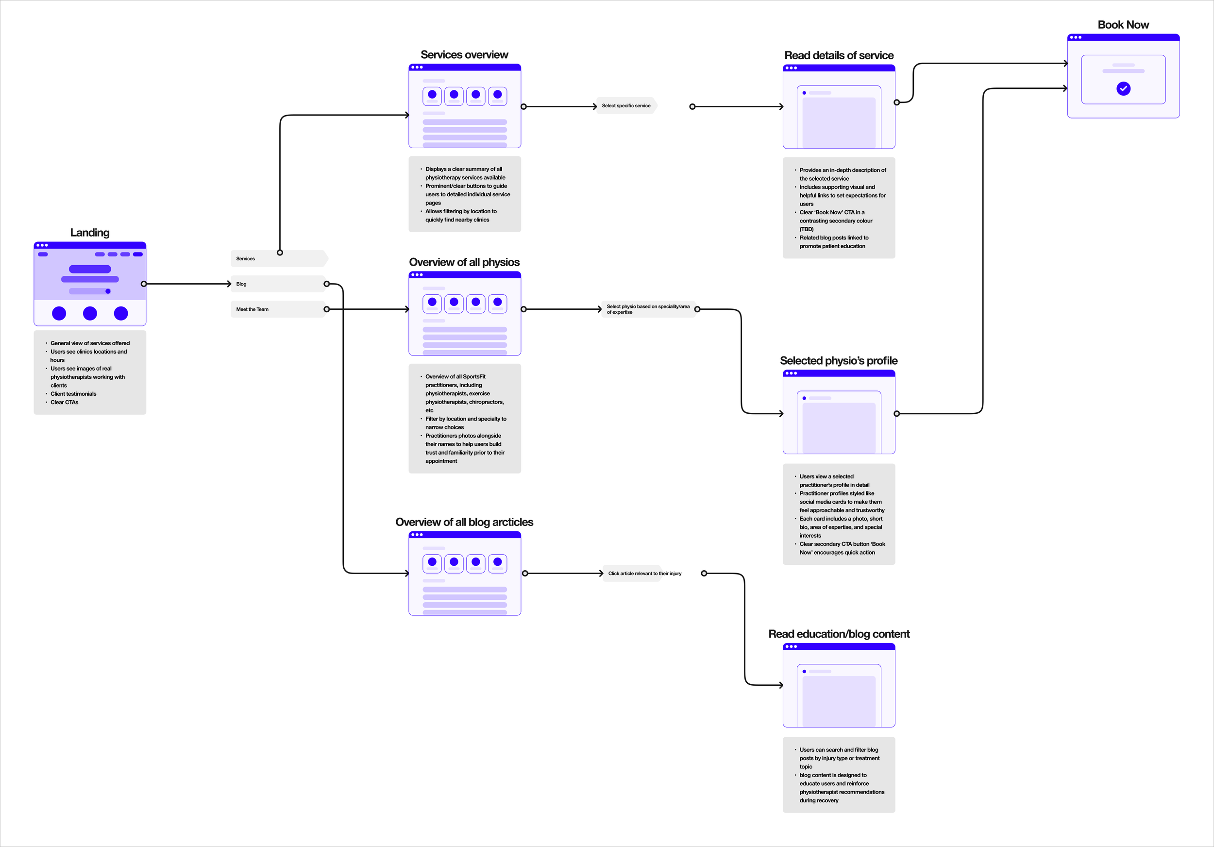
Understanding the complete user experience.
While user flows helped define the functional pathway, the journey map allowed me to understand the emotional experience behind each step. Mapping Mark’s journey revealed moments of uncertainty and hesitation, highlighting opportunities to reduce friction, strengthen trust, and support users throughout their decision-making process.
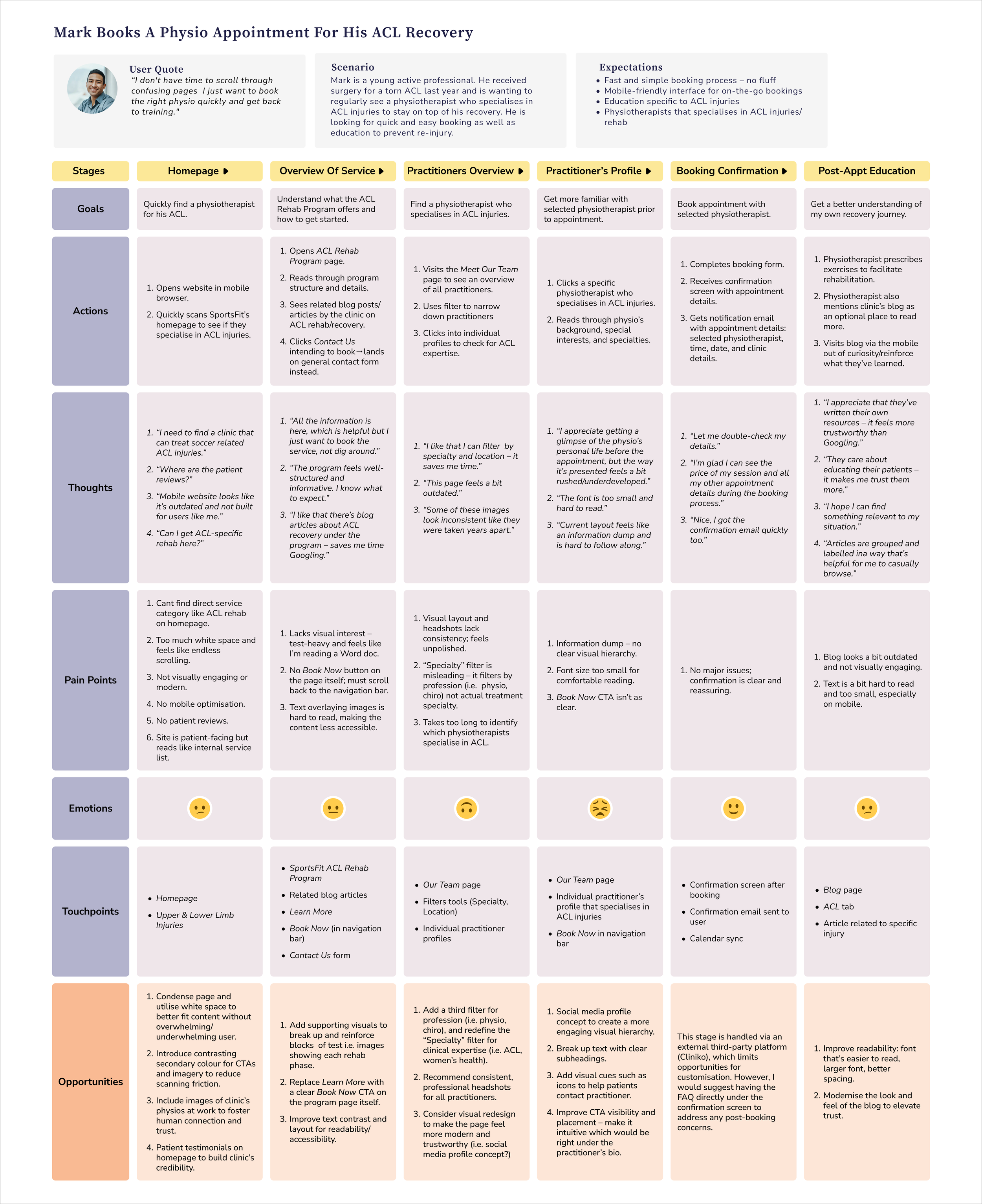
**Constraint: The final appointment booking step was handled through a third-party booking platform, which limited opportunities for direct interface changes. As a result, the redesign focused on improving the journey leading users to booking through clearer service information, stronger CTAs, and reduced friction before handoff.
WIREFRAMESFrom research to structure.
With the research synthesised into clear design opportunities, I began translating insights into low-fidelity wireframes. These acted as the blueprint for the redesign, allowing me to define the information architecture, content hierarchy, and key user flows before focusing on visual design.
I referenced the existing website and my research to identify which elements to retain, refine, or remove, iterating on layouts that better addressed the usability issues uncovered during research. Starting with desktop allowed me to establish the core information architecture and interactions before adapting key screens for mobile, ensuring the experience remained intuitive across devices.
These wireframes provided an opportunity to validate the overall layout and user journey with the client, creating a solid foundation before progressing to high-fidelity designs.
Homepage
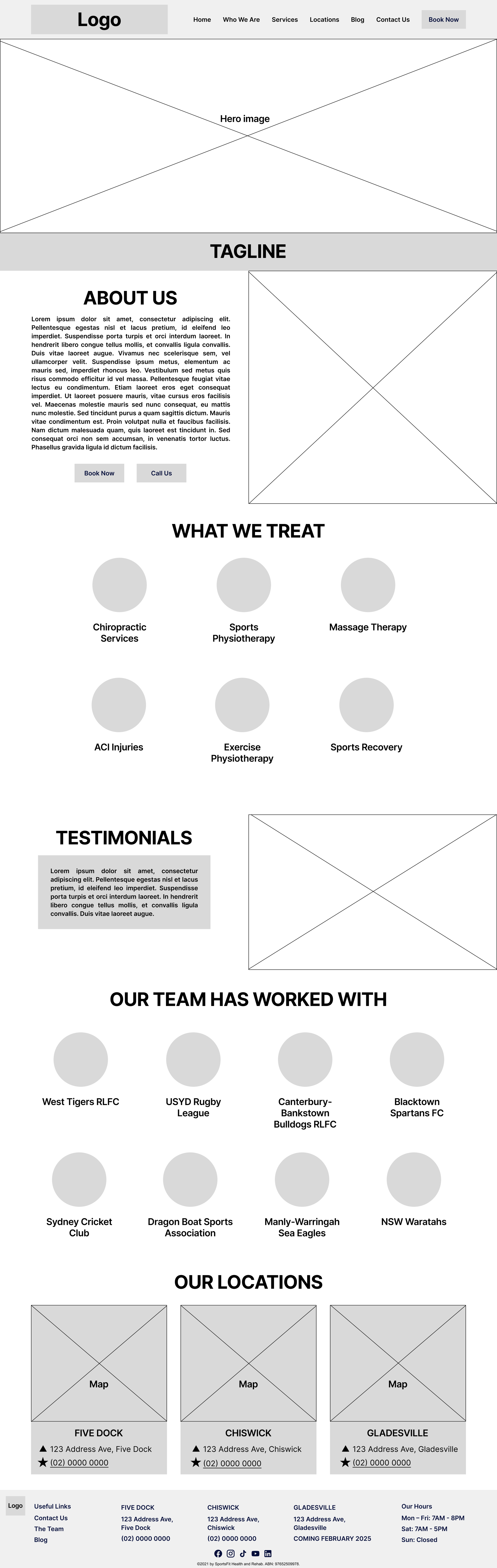
Streamlined navigation to focus on the most important subpages for quicker decision-making
Introduced practitioner imagery and a clear tagline to build trust and communicate the clinic's value upfront.
Condensed About section to give a quick overview without overwhelming the user
Included Testimonials section to build trust through social proof
Locations are displayed in a single line for better scanning and readability
Services Overview
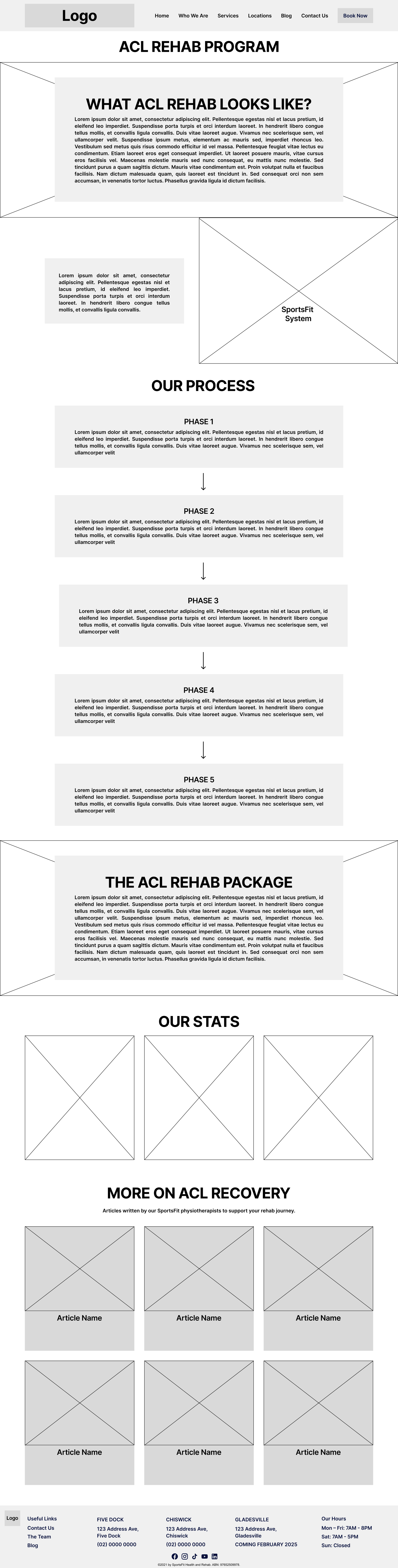
Moved the SportsFit System higher to introduce the process earlier and guide users through the treatment journey from the start
Grouped each rehabilitation phase into individual cards to improve scanability and make complex information easier to digest
Consolidated all ACL Rehab content onto one page, so all ACL-related information is accessible from one place
Repositioned the Our Stats section to strengthen visual hierarchy and reinforce credibility at a more impactful point on the page
Added an introduction to the educational content to highlight in-house expertise and encourage users to explore related resources.
Our Team
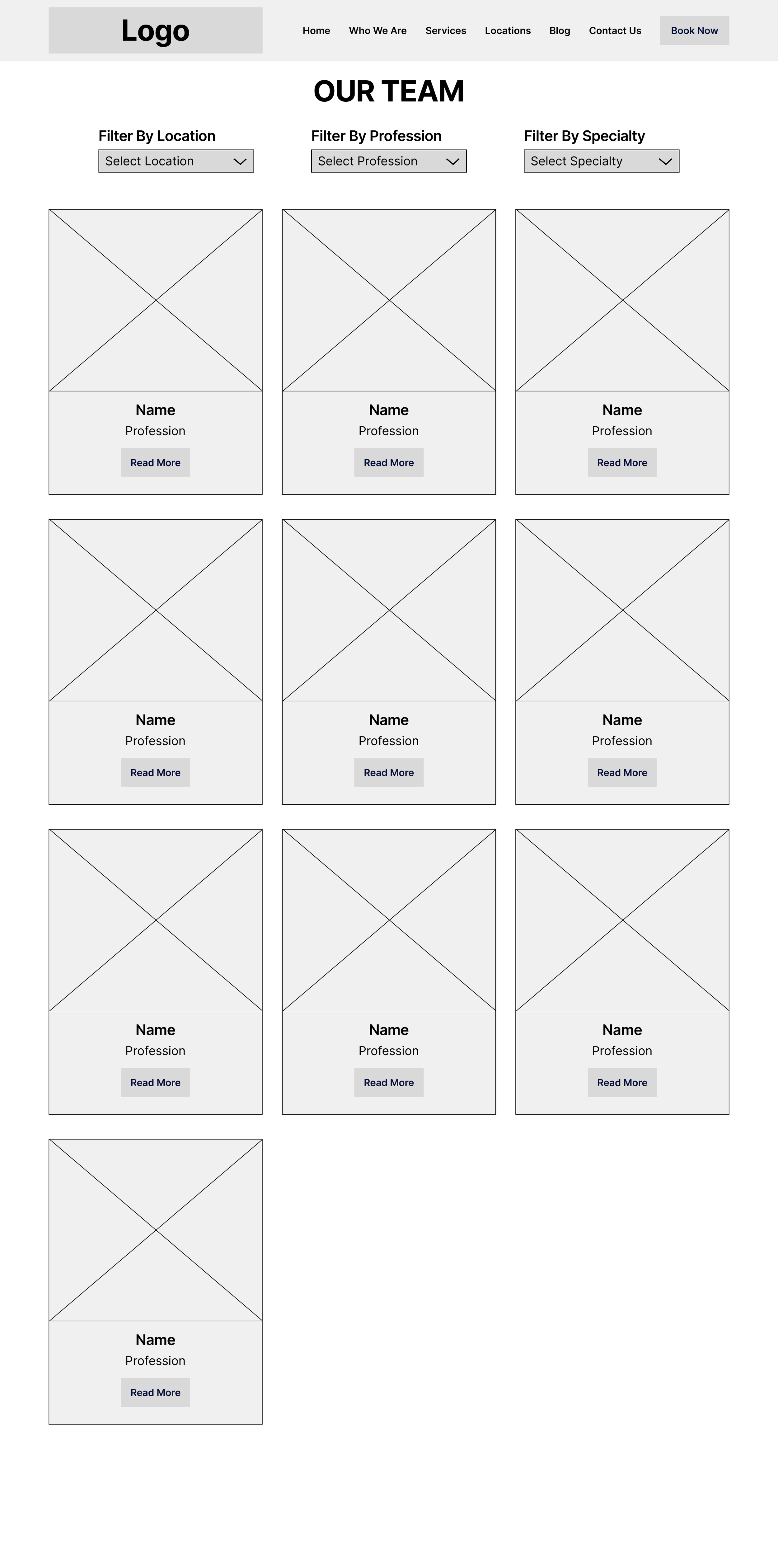
Added Profession and Specialty to help users further filter their search and find the right practitioner faster
Practitioner’s Profile
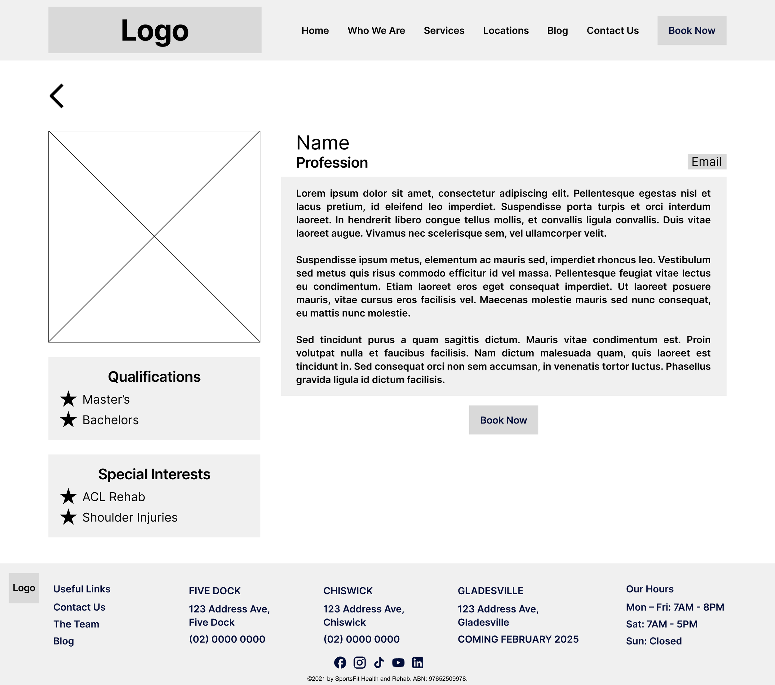
Adopted a social media–style layout to make practitioner details more engaging and easy to read
Introduced a clear CTA to guide users intuitively toward booking or contacting the practitioner
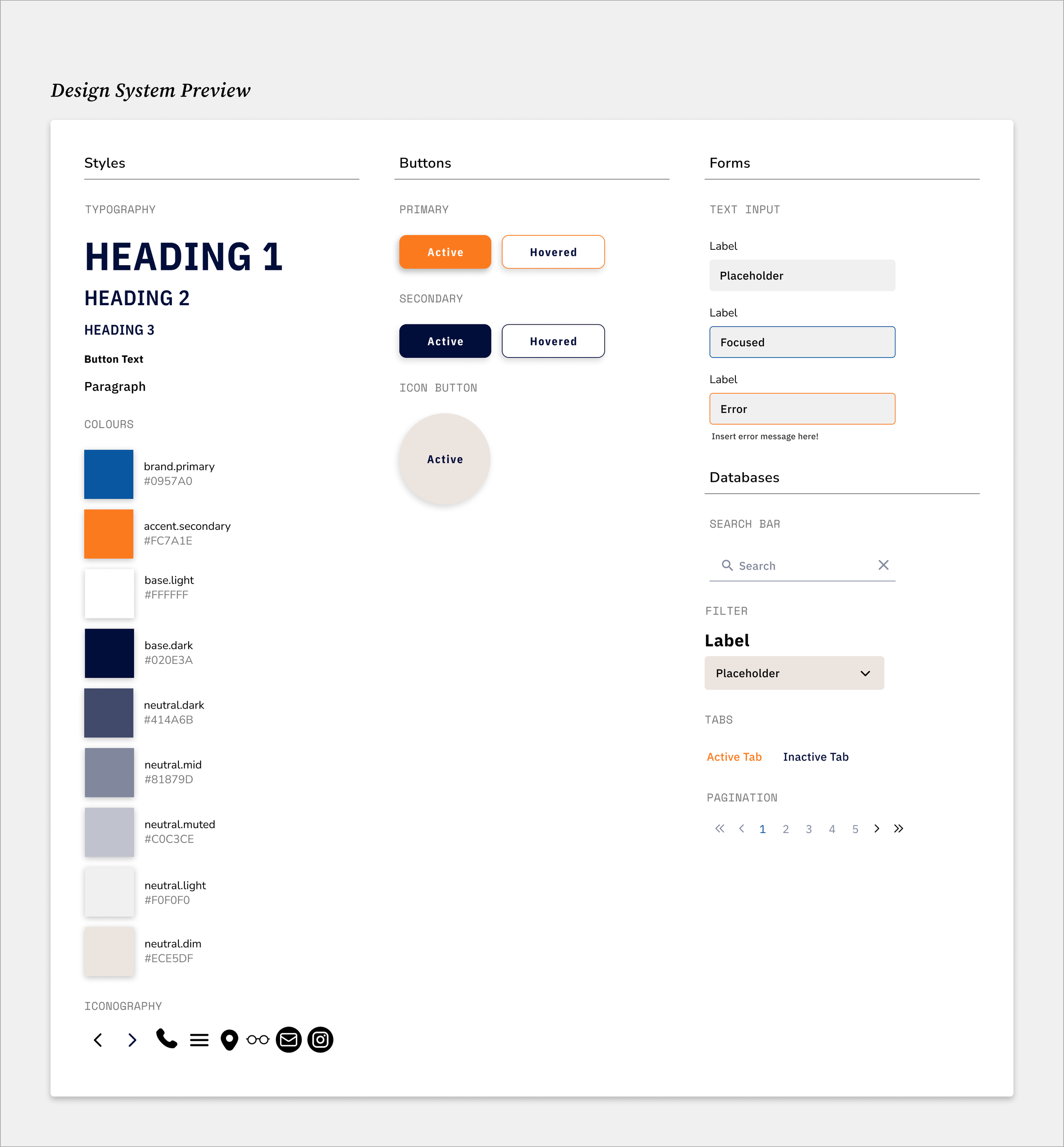
DESIGN SYSTEMWith the site structure established through wireframing, I shifted my focus to the visual direction. Working closely with the client, I identified key brand attributes to guide the look and feel of the redesign, ensuring it reflected SportsFit’s identity while supporting usability.
These principles informed a simple design system that established a consistent visual language across the website, streamlining the design process and creating a cohesive experience for users.
Creating a visual language.
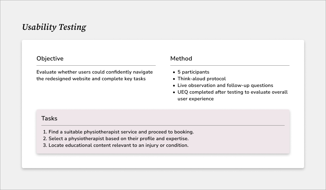
USABILITY TESTINGWith the low-fidelity wireframes in place, I ran usability testing to see how real users interacted with the designs. I asked participants to complete key tasks, such as booking a service, selecting a physiotherapist, and exploring educational content, while observing where they hesitated, missed CTAs, or struggled with navigation. These sessions highlighted friction points early and provided me with the insights I needed to refine the flows, improve clarity, and ensure the site worked for both users and the business.
Testing assumptions early.
UEQ RESULTSResults from the UEQ yielded an overall score of 2.4, indicating a positive perception of the redesigned website’s usability and overall experience.
KEY USER INSIGHTSNavigation needed clearer signposting

Users expected more predictable navigation patterns and overlooked elements such as filters and secondary icons.
Iteration: Improved visibility of interactive elements and refined navigation patterns to better match user expectations.
Booking actions needed stronger visibility
All participants expected a clear Book Now CTA within service pages rather than replying only on the navigation bar.
Iteration: Added contextual CTAs throughout key pages to reduce friction and guide users towards bookings.
Visual consistency should be strengthened

Users described the design as modern and professional, but some pages felt visually disconnected.
Iteration: Refined typography, colour usage, and image treatment to creat
Content needed stronger hierarchy

Users valued the amount of information available but often skimmed dense sections to find relevant details.
Iteration: Restructured content using clearer headings, spacing, cards, and visual cues to improve scanability.
Authentic imagery strengthened trust

Participants responded positively to real clinic imagery, describing it as more personal and trustworthy.
Iteration: Prioritised authentic photography and improved consistency across practitioner imagery.
IMPACTFollowing the redesign, I analysed website performance data from 2 February 2025 to 2 June 2025 to understand how users interact with the updated experience. The results showed improvements across engagement, content exploration, and returning visitors.
Improving engagement and user confidence
↓15% decrease in bounce rate
Users were more likely to engage with the website rather than leaving after viewing a single page, suggesting the improved structure and clearer pathways helped users find relevant information.
↑17% increase in returning visitors

More users returned to the site, reflecting increased engagement and ongoing value from the website content.
↑19% increase in paged per session

Users explored more content across the site, indicating stronger navigation and improved discoverability of services and educational resources.
↑9% increase in average session duration
Users spent more time engaging with content, suggesting the redesigned experience better supported information discovery and decision-making.
REFLECTIONThis was my first end-to-end client project, where I worked within the constraints of a website builder and operated in a hybrid designer–front-end role. While the project was a redesign and I wasn’t starting from scratch, I found that working within Wix introduced notable limitations in navigation control, responsiveness, and scalability.
Certain interaction functions, such as enabling a “back to previous selection” button, were restricted by the platform, and translating layouts from desktop to mobile required adjustments in developer mode. These constraints highlighted that Wix may not be suitable for long-term scalability and user experience goals for growing businesses like SportsFit.
A key lesson from this project was recognising how unpredictable user needs can be. During the research phase, I believed I had a strong understanding of physiotherapy booking behaviours based on personal experience as a patient. However, usability testing revealed nuanced differences in expectations – even among users with the same injury. For example, during the usability testing stage, when discussing the potential introduction of an AI chatbox, one user who had previously sustained an ACL injury viewed it as unnecessary. At the same time, another saw value in it as a preliminary guidance tool before booking. This reinforced that assumptions, even informed ones, must always be validated through research.
Ultimately, this project strengthened my belief that effective design is about balance: guiding users clearly toward action while preserving autonomy and trust. Strategic prompting improves conversion; over-direction does the opposite.
NEXT STEPSEstablish stronger visual consistency

Standardising practitioners' profile pictures (same uniform, background, composition, and framing) would reinforce brand cohesion and strengthen the clinic’s professionalism.
Platform scalability improvements

Migrating to a more flexible website builder or collaborating with a developer would address current platform constraints (e.g. limited navigation control and responsiveness limitations within Wix), enabling more refined interaction patterns and scalablility.
Explore AI-assisted support (strategically)

The client expressed interest in introducing an AI chat feature. Before implementation, user needs should be validated to ensure the implementation meaningfully supports booking behaviour or patient education, rather than adding unnecessary complexity and costs.