HANDED OFF 2022Anglicare Connect
SKILLSTOOLSInformation Architecture
Workflow Optomisation
TIMELINEROLEJune – August 2022
UX/UI Designer
User Research
Systems Thinking
Designing a unified staff portal for faster, more connected care.
OVERVIEWAs part of a design team, I designed a centralised staff portal that replaced multiple disconnected systems with a single, streamlined experience. The platform helped staff manage service bookings, access resident information, and coordinate care more efficiently across Retirement Living and Anglicare At Home.
PROBLEMDisconnected systems were slowing down delivering care.
Staff relied on multiple applications to manage bookings, access information, and communicate across teams, creating unnecessary friction in everyday workflows. Switching between systems increased the risk of delays and miscommunication, making it harder to deliver timely, coordinated care. Anglicare needed a single platform that simplified essential tasks and enabled staff to focus more on supporting residents than navigating technology.
PROJECTED IMPACTFrom usability improvements to organisational value.
Anglicare Connect was designed to address the workflow challenges identified throughout our research, with the potential to improve how staff access information, coordinate services, and document client interactions.
Reduce administrative friction

Centralising client information, service bookings, contacts, and communication in one portal could reduce the time staff spend switching between systems and searching for information. This creates a more streamlined workflow, particularly for care workers managing multiple clients across locations.
Create a foundation for future scalability

The centralised portal provides a scalable foundation for expanding Anglicare Connect with additional workflows and functionality as staff and organisational needs evolve.
Improve communication and continuity of care

Bringing client interactions and communication into a shared system could reduce information gaps and unnecessary follow-ups. Staff can access a clearer record of client activity, helping teams stay informed and coordinate care more effectively.
Support staff working on the go

Features such as quick-access information, streamlined note-taking, and voice notes were designed around the realities of mobile care work. This could make it easier for staff to document interactions between appointments without adding unnecessary administrative burden.
**Supporting research: Studies of centralised and automated systems have demonstrated efficiency gains in other operational contexts, supporting the potential value of consolidating Anglicare's workflows into a single platform.
https://www.canarytechnologies.com/hotel-terminology/central-reservation-system-crs
https://arxiv.org/abs/2303.12494
https://gatheroo.io/centralise-to-optimise-centralised-client-communication/
SOLUTIONTransforming fragmented workflows into one connected experience.
Our research revealed that care workers needed more than access to information – they needed a faster, more connected way to manage client relationships throughout a busy day. Our team designed Anglicare Connect around four key moments in the staff workflow: accessing essential information, finding the right person, understanding a client's needs, and accurately documenting interactions.
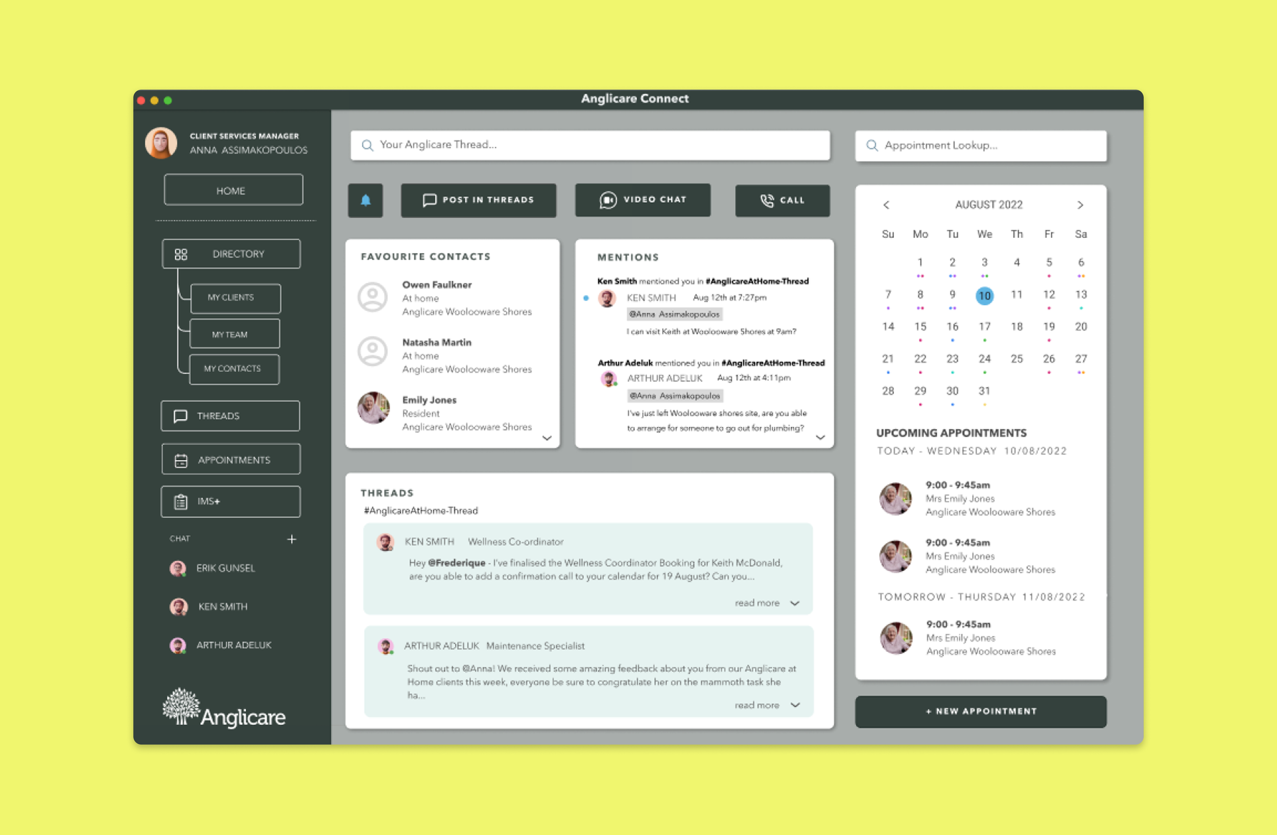
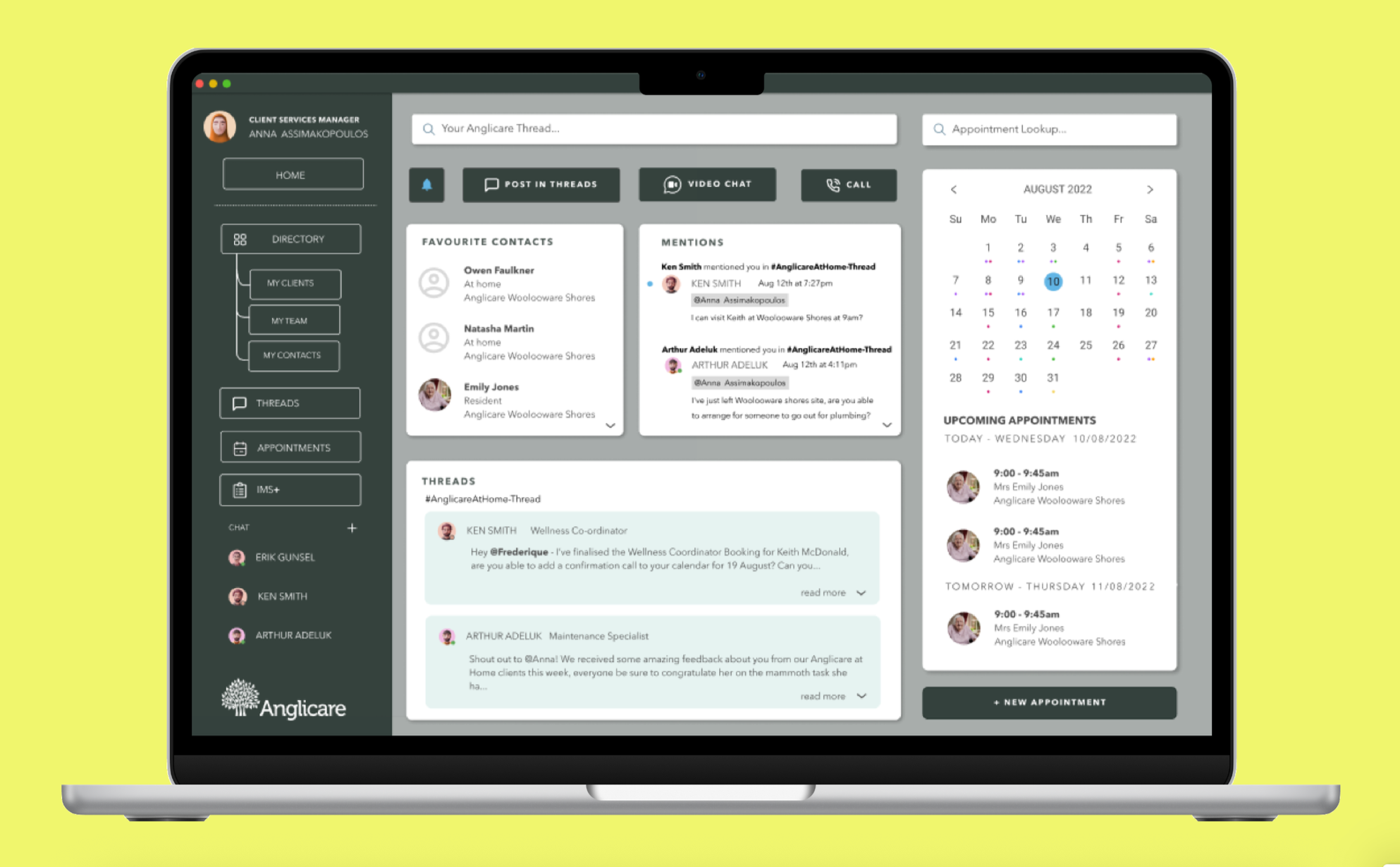
A dashboard designed around the working day.
The staff dashboard brings the information and communication tools that care workers need into a single centralised view. Rather than navigating between different systems, staff can quickly access upcoming appointments, favourite contacts, messages, mentions, and threads from a single location.
The calendar provides an at-a-glance view of appointments, while clear notification indicators make new messages easier to identify. Staff can also communicate through messages, calls, and video chat without leaving the platform.
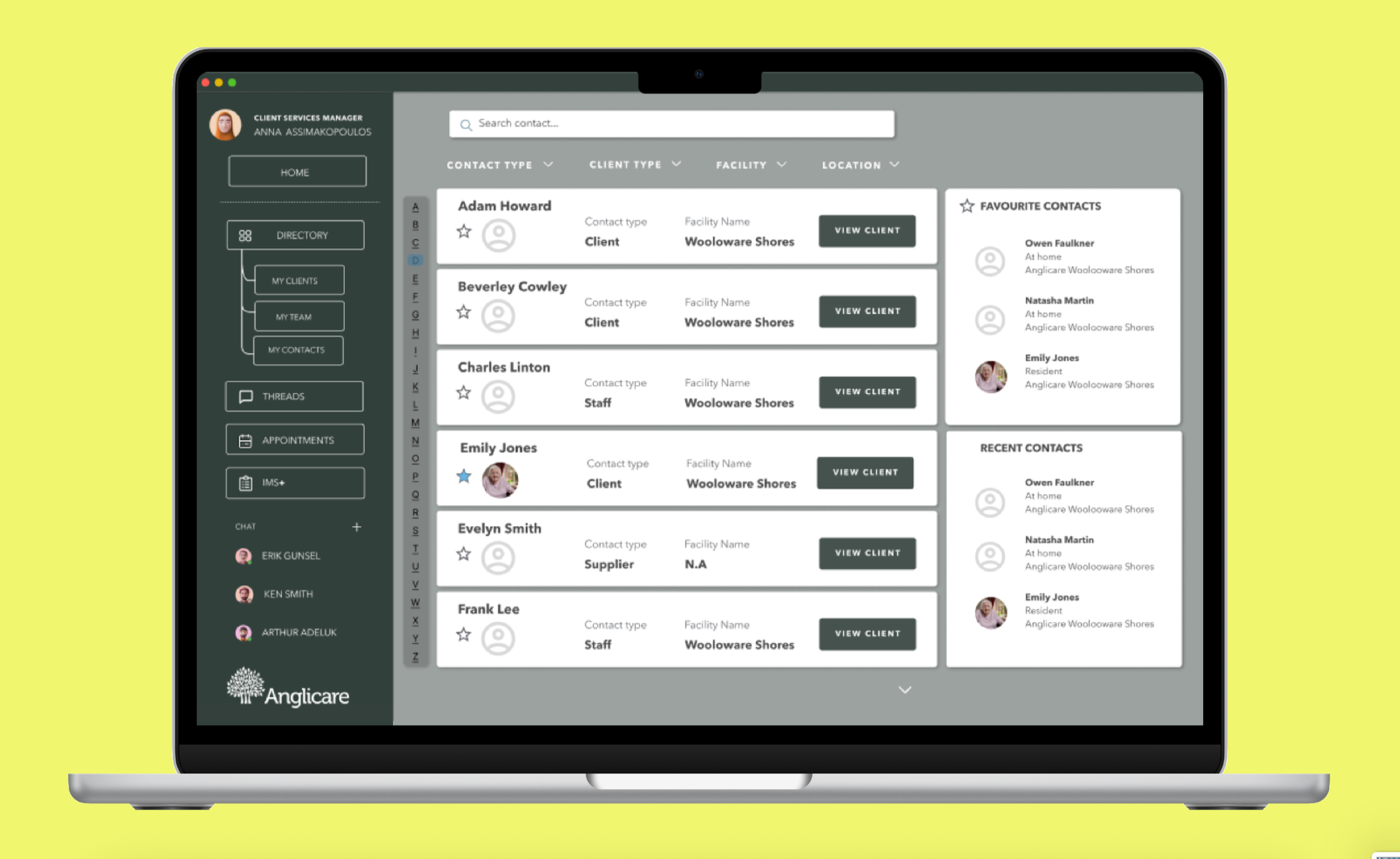
Finding the right person, faster.
The directory provides a central place to find clients, team members, suppliers, and other contacts. Staff can search by name or narrow results using filters such as contact type, client type, facility, and location.
Favourite and recent contacts provide quick access to people staff interact with regularly. We also used clear action buttons rather than making the entire contact card clickable, reducing ambiguity for staff with varying levels of digital confidence.
Putting the client at the centre.
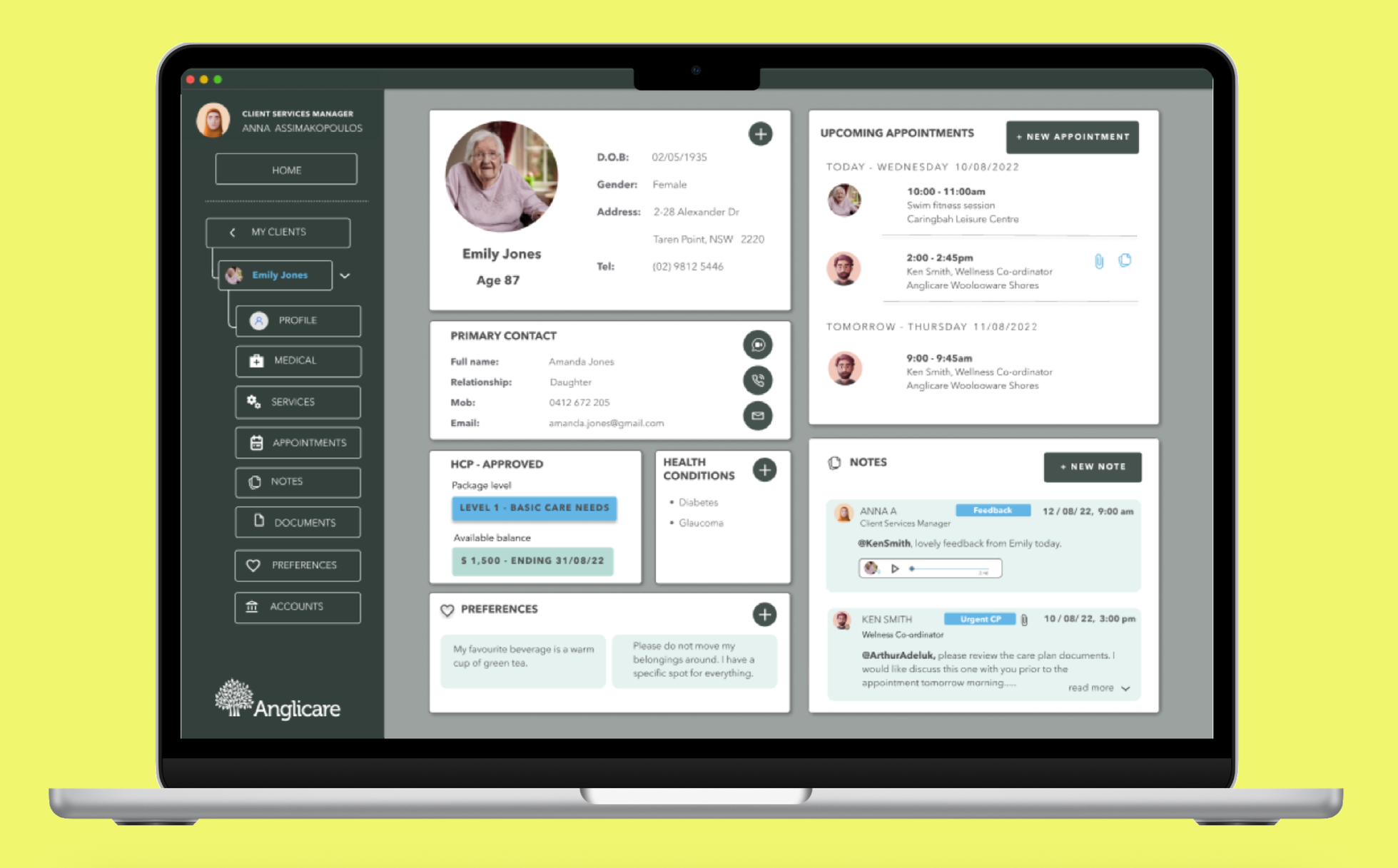
The client profile brings critical information together in one view, giving staff a quick understanding of the person they are supporting. It includes personal details, primary contact information, appointments, recent notes, care package information, and personal preferences.
Staff can contact the client's primary contact, view or add appointments, and review recent interactions without leaving the profile.
Making documentation easier and more flexible.
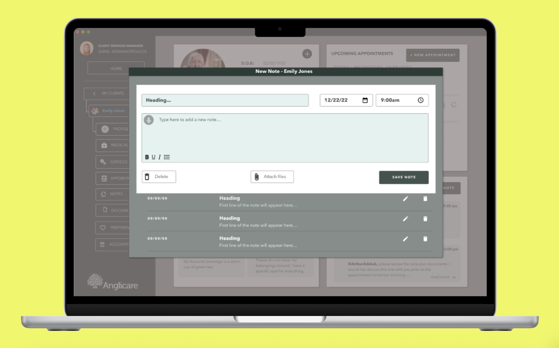
Adding notes was designed around the reality that care workers don't always have time to document an interaction immediately after a visit. Staff can select the date and time of an interaction, attach relevant files, and record a voice note directly from the client profile.
The ability to backdate notes was particularly important, reflecting research around the need for accurate records when documentation cannot happen in real time.
RESEARCHUnderstanding the workflows behind quality care.
To understand existing workflows and operational challenges, we conducted three interviews with Anna, the Anglicare @ Home Subject Matter Expert (SME). While direct access to staff and residents was outside the scope of the project, these interviews provided valuable insight into understanding the current service delivery process.
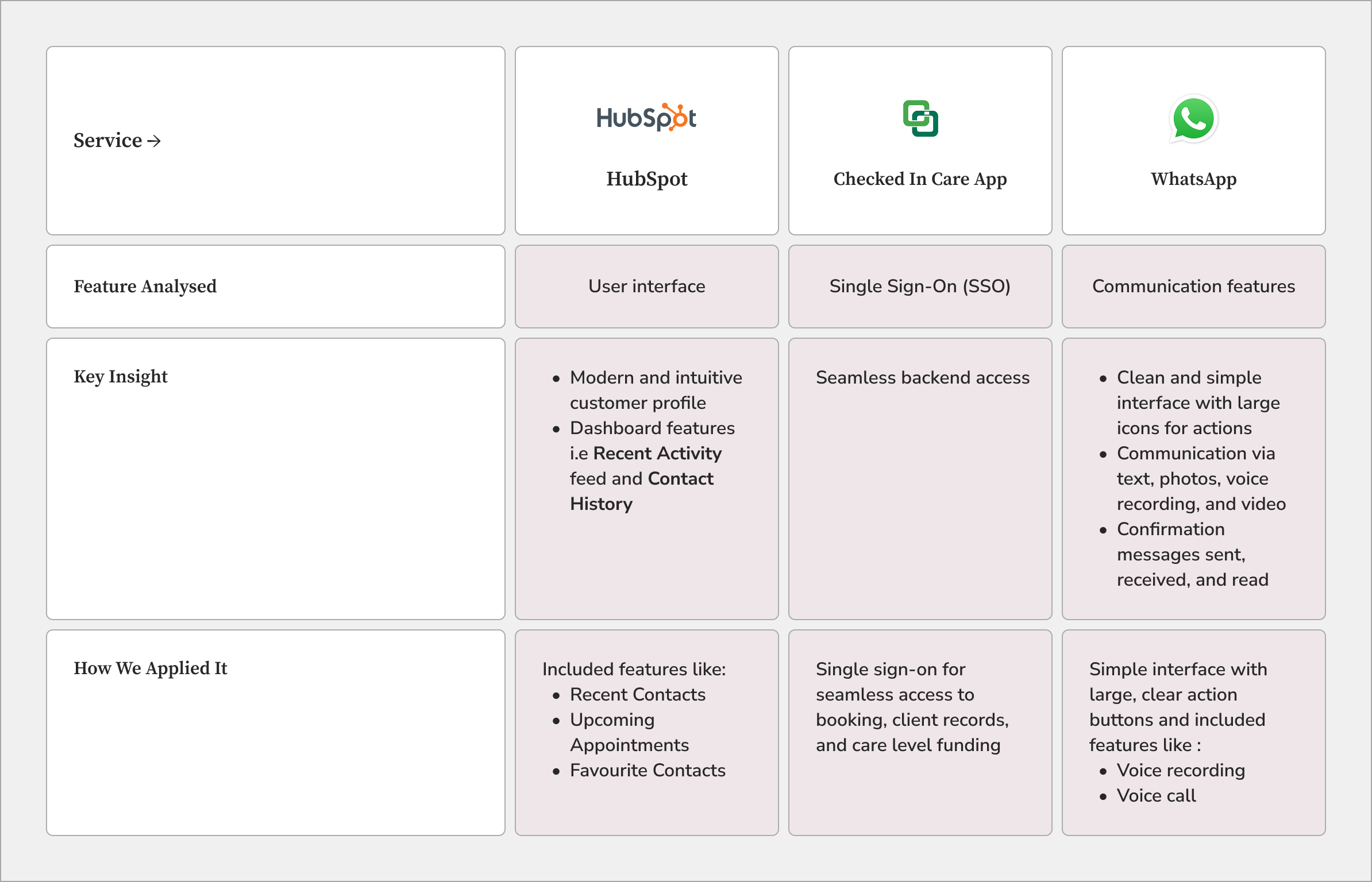
To complement these insights, we carried out a targeted competitor analysis, examining communication tools, booking experiences, and interface patterns across similar platforms. Rather than reviewing entire products, we focused on features that aligned with the project's goals and identified opportunities to simplify workflows and improve information access.
RESEARCH SYNTHESISTurning research into design opportunities
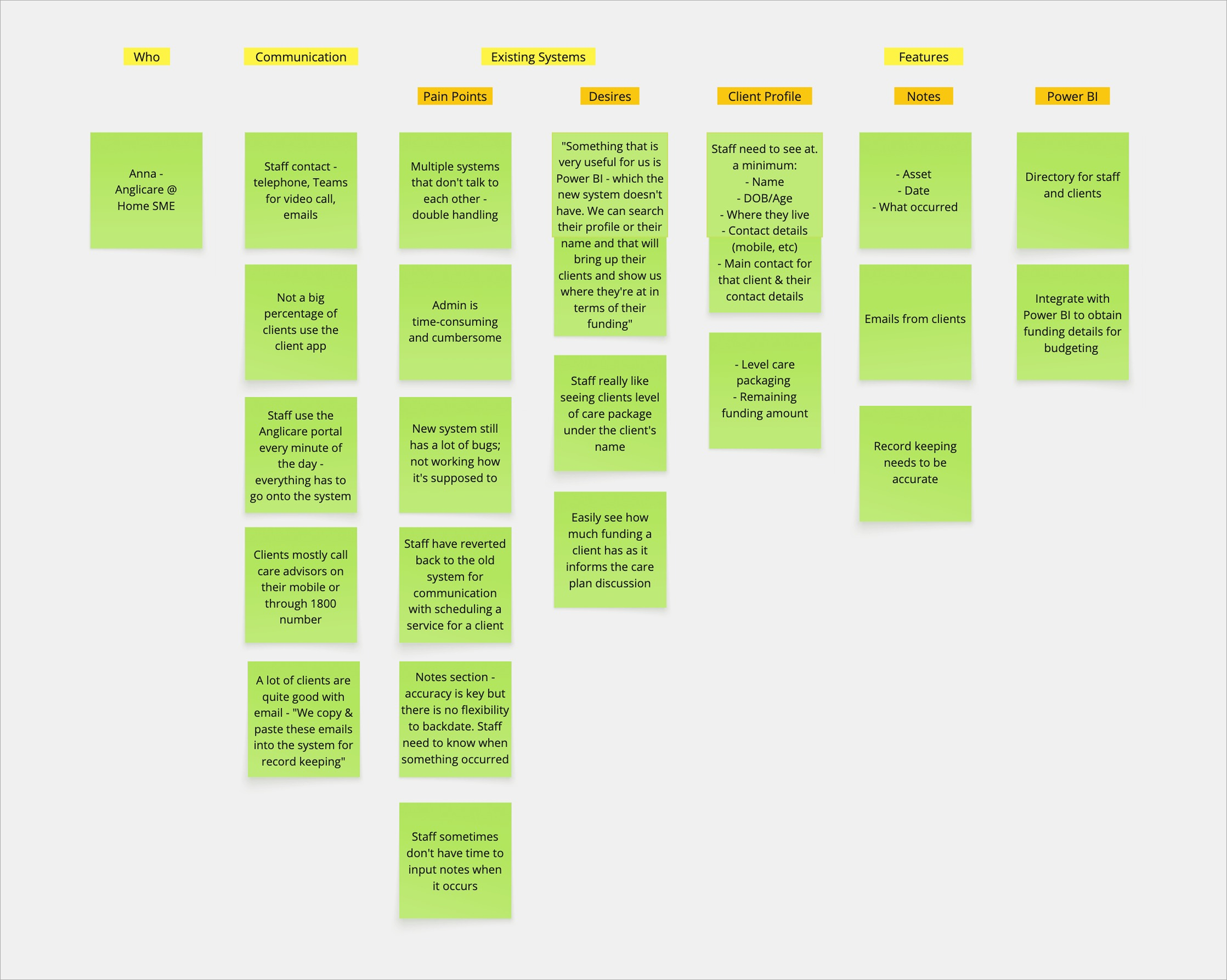
With a clearer understanding of the existing workflows and opportunities for improvement, we synthesised our findings through affinity mapping to identify recurring themes and define the key user needs that guided the design process.
Uncovering the challenges behind fragmented care workflows
Through affinity mapping, we grouped research observations into four key themes:
Staff required more flexibility with record-keeping
Staff often moved between client homes and had limited time to record notes immediately. The existing system lacked the ability to backdate entries, creating challenges for accurate and timely record keeping.
System reliability was essential for staff adoption
Technical issues and bugs caused staff to revert to previous tools for communication and scheduling.
Decision-making required quick access to important information
Staff valued tools such as Power BI as they provided a centralised view of client information. Having key information available at a glance improved efficiency and confidence when supporting clients.
Desktop was preferred over mobile
Although staff are frequently mobile while supporting clients, desktop remained the preferred platform for both clients and staff.
Defining the challenge.
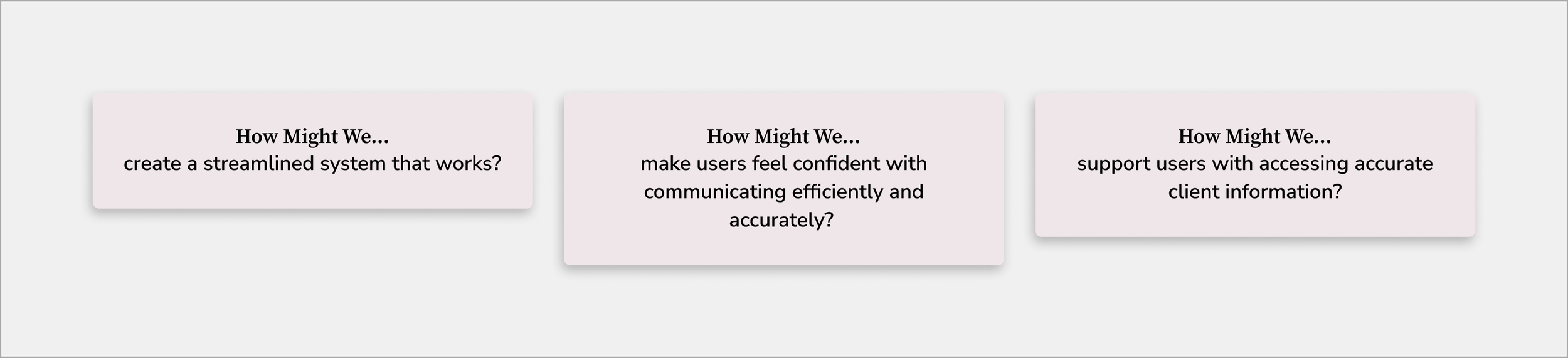
Building on the affinity map, we translated our key findings into a set of How Might We statements. These open-ended questions helped reframe user pain points as design opportunities, guiding ideation while keeping the needs, behaviours, and motivations of Anglicare's staff at the centre of the design process.
DESIGN OPPORTUNITIESPutting opportunities into context
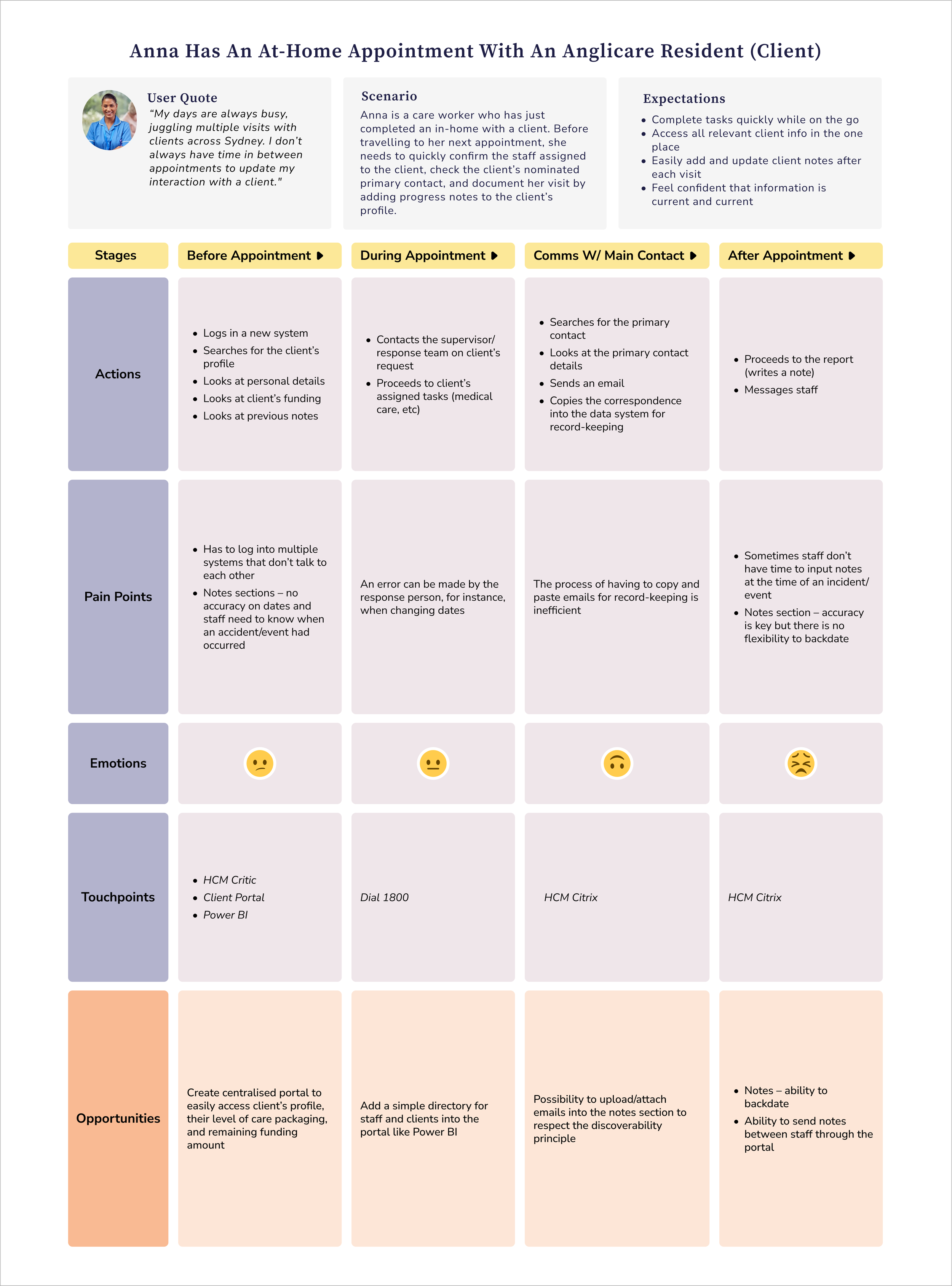
While the How Might We statements identified what needed to be improved, the journey map revealed where those challenges occurred throughout Anna's day. Mapping her experience uncovered key moments of friction, helping prioritise opportunities to simplify workflows, improve access to client information, and support care workers in completing essential tasks more efficiently.
Difficulty accessing information

Staff find it challenging to access important resident details across multiple platforms quickly.
Design response: Create a single, unified interface where staff can quickly access resident details, assigned team members, and primary contacts without switching between systems.
Time constraints
Staff sometimes struggle to input notes and updates in real-time due to their busy schedules.
Design response: Simplify common tasks with intuitive navigation and efficient note-taking features, enabling staff to complete documentation quickly between appointments.
Communication gaps

Inability to backdate notes leads to incomplete records and delayed information sharing.
Design response: Features that allow staff to record, edit, and backdate client interactions while maintaining accurate and up-to-date records for the wider care team.
USABILITY TESTINGTesting assumptions early.
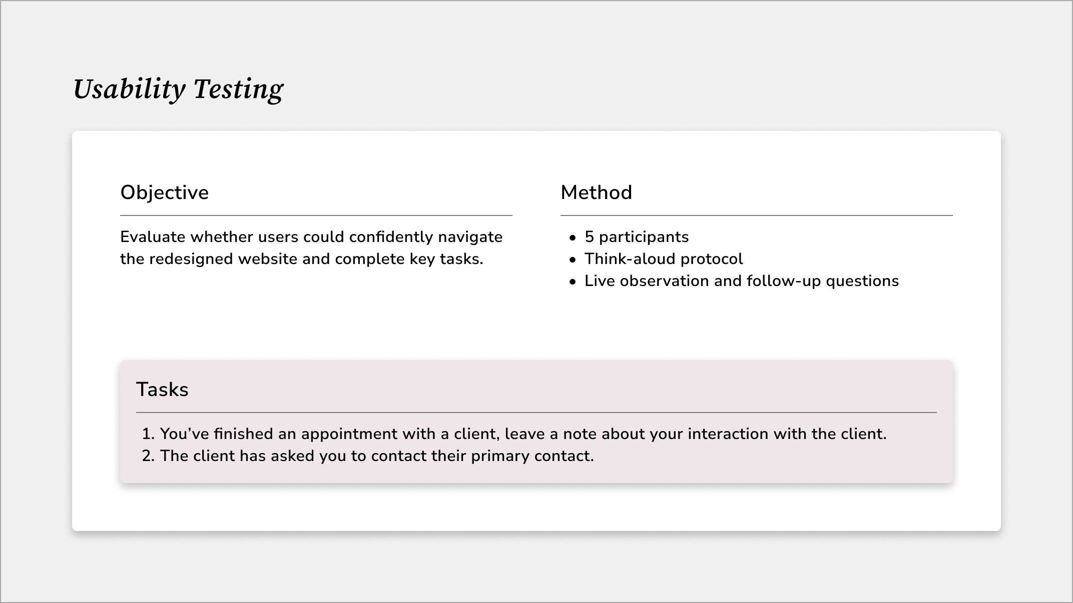
With the high-fidelity wireframes in place, I ran usability testing to see how real users interacted with the designs. I asked participants to complete key tasks, such as leaving a note on the client’s profile and locating the client’s primary contact, while observing where they hesitated, missed CTAs, or struggled with navigation. These sessions highlighted friction points early and provided us with the insights we needed to refine the flows, improve clarity, and ensure the site worked for users.
KEY USER INSIGHTSInformation was easy to scan

Users could quickly locate important information, with colour-coding helping them distinguish key details.
Iteration: Retained visual cues while refining the colour system to create a more cohesive and accessible interface.
Note-taking felt efficient
Users found adding notes straightforward, with the voice-note feature particularly useful for documenting interactions quickly.
Iteration: Retained the streamlined note-taking workflow and voice-note functionality.
Context was missing from notes
Users weren't always sure who had written a note.
Iteration: Added staff job titles beneath names to provide clearer context and improve accountability.
Dashboard needed stronger cues

Users wanted more visibility of activity from the staff dashboard and weren't immediately sure which messages were unread.
Iteration: Introduced a blue notification indicator and unread dot, and expanded the dashboard to surface unread messages and favourite contacts.
REFLECTIONThis project was both challenging and formative. Working with a client meant that much of our understanding of care workers came through her perspective and the experiences they had shared with her, rather than through direct access to the end users themselves. This made it difficult to validate assumptions about their day-to-day workflows and understand the nuances of their existing processes.
Not having access to the previous system also presented a challenge. Rather than redesigning an existing interface, we were designing a new experience from scratch, using our research and competitor analysis to establish a foundation for the product.
This experience reinforced the importance of usability testing, particularly when access to primary users is limited. Testing gave us an opportunity to challenge our assumptions and identify issues that weren't apparent during the design process. For example, users highlighted the need for clearer unread-message indicators and job titles to identify staff members adding notes to a client profile, which we incorporated into the next iteration.
Most importantly, the project taught me that designing with limited information requires a willingness to remain flexible. Rather than treating our initial designs as the final solution, we used testing to validate what worked, identify what didn't, and refine the experience based on user feedback. While our testers weren't the primary users, their feedback still revealed usability issues and helped us identify areas that needed greater clarity. It reinforced the value of designing iteratively and remaining open to changing a solution when testing reveals a better direction.
NEXT STEPSCollaborate during development

To ensure this product meets the needs of their users, Anglicare staff should be collaborated with throughout the developmental phase to align the system with their real-world workflows and preferences.
Develop a mobile app
Since users are constantly on-the-go, developing a mobile app would accomodate users who want to quickly update a clients profile when they can’t reach for their laptop.